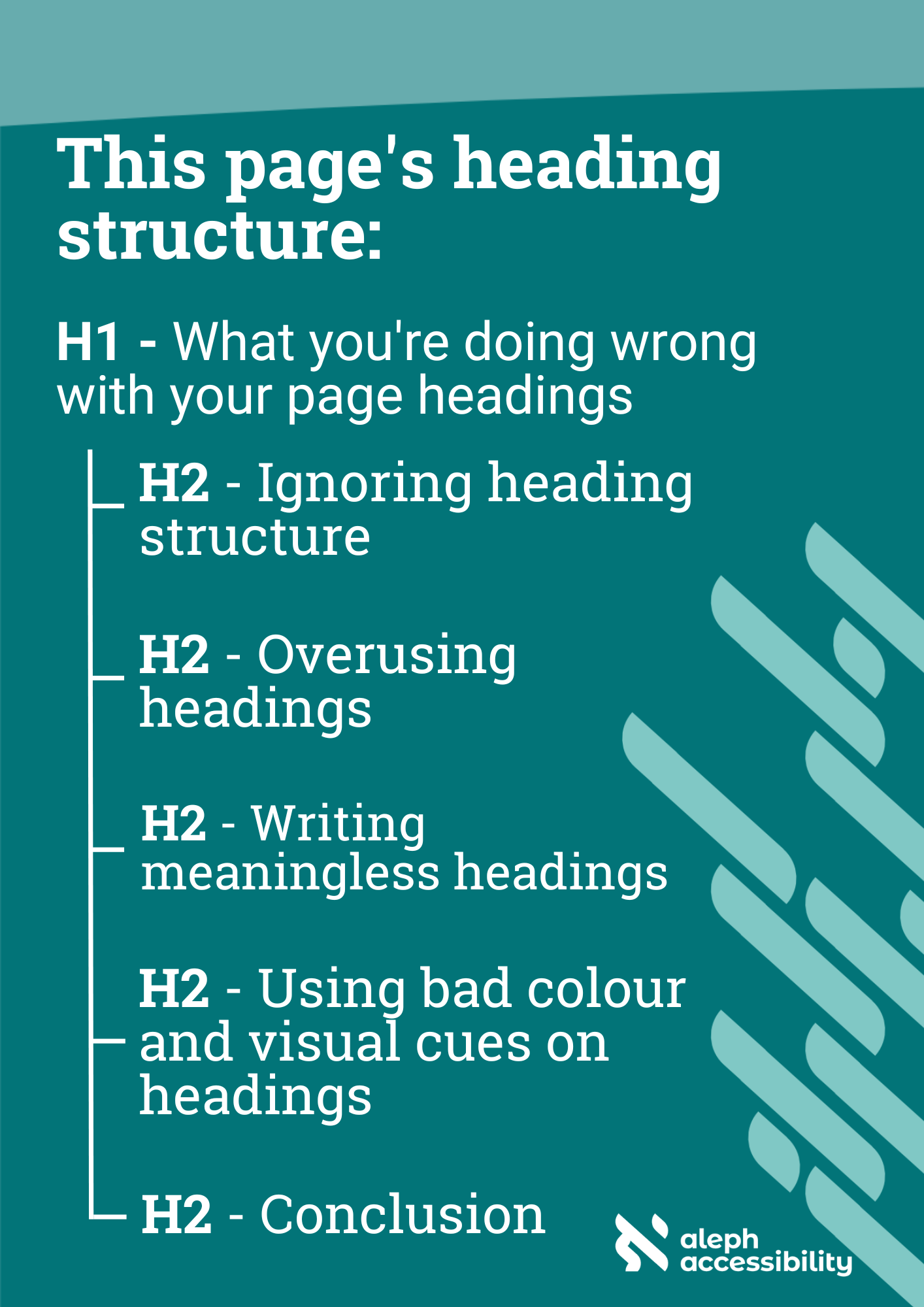
What you're doing wrong with your page headings
When it comes to web design and content, headings play a crucial role in the accessibility of your website's information. But common oversights with headings means breaking the logic of the page for our users! Let’s delve into the most frequent issues with page headings and provide essential accessibility tips to ensure an inclusive and user-friendly experience for all.
Ignoring heading structure
Just as many sighted users scan a page, using headings as clues to find out what the page is about, the heading structure in HTML helps assistive technology users like screen reader users do the same thing.
One of the most common errors is using heading elements (e.g., H1, H2, H3, etc) solely for visual aesthetics rather than following a logical heading structure. The different heading levels are meant to denote the page's hierarchy. When that's used purely for styling, we tend to ignore the hierarchy, resulting in a broken, confusing page structure.
Accessibility Tip:
Map out your heading structure before the page gets built or content gets added. Start with a descriptive H1, then write the hierarchy of your page based just on its headings, like a page outline.
Overusing headings
Keyboard-only users, including those with motor disabilities, rely on keyboard navigation to browse websites. When page headings are used excessively (e.g., repeating the navigation menu headings), it can create navigation barriers for these users, forcing them to tab through irrelevant content repeatedly.
A heading denotes a section. A heading shouldn't be used just because the text is large or is meant to grab attention. Forms and lists have ways of titling content without using headings.
Accessibility Tip: Headings aren't always necessary. For example, "Accessibility Tip" at the beginning of this block is emphasized by bolded text but it is not a heading. Visual styling helps draw the attention of sighted users and the code element
strongindicates the styling to assistive technology users, keeping the page logic in tact.
Writing meaningless headings
Using vague or meaningless headings can be frustrating for all users, but it can be particularly disorienting for those with disabilities. A well-crafted heading should concisely convey the topic of the content it introduces.
Make sure your headings accurately represent the content beneath them. Opt for descriptive and informative headings that provide context, making it easier for all users to comprehend the content's purpose.
Accessibility Tip: Headings should be unique! If your H1 is "Apple Cake Recipe" there shouldn't be another heading with the same text. (This is another reason why the "Accessibility Tip" blocks in this article don't take that text as a heading - because it would be repetitive and lose its meaning.)
Using bad colour or visual cues on headings
Headings that solely rely on color to distinguish them from regular text can be problematic for users with visual impairments or color vision deficiencies. Low contrast between text and background colors can also pose challenges for readability. Use multiple methods of indicating a heading, like font size, style or weight (bolding).
Accessibility Tip: Does your branding use a low-contrast colour as a primary colour, like yellow or orange? Use that colour as an accent like an underline, shadow or decorative symbol instead of using the colour as the heading text.
Conclusion
Taking the time to optimize your page headings for accessibility is a small but significant step towards creating a more inclusive web experience. By structuring headings logically, using descriptive language, providing skip links, and considering color and contrast, you can enhance your website's reach and usability for all users, regardless of their abilities.
Find out more about Aleph Accessibility's auditing, training and consulting services. Or get in touch to start or accelerate your accessibility journey.


