
WCAG Criteria, explained: 1.4.1 Use of color
WCAG Definition
"Color is not used as the only visual means of conveying information, indicating an action, prompting a response, or distinguishing a visual element."
Plain Language
Use more than just color to communicate information.
Why it matters
Not everyone has the same abilities for vision and colour. People may be colour blind, have difficulty with low contrast or experience partial blindness. Having an additional method of communicating visual information means giving those people a way to still understand your content.
Example 1
Indicating the “active” link in a nav bar by changing that link’s font color relies on a user’s ability to see color. Adding an underline to the active link in addition to the color change will enhance its accessibility. The code under the hood should also communicate the active state.

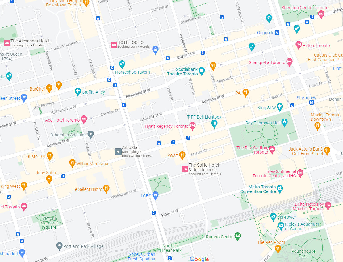
Example 2
A map with pins highlights city attractions. The color of the pin indicates the type of attraction. In addition to color, use an icon on the pin to also communicate the type of attraction.
Example 3
While online shopping, you add an item to your wishlist by clicking a heart icon. That icon goes from a black outline of a heart to a solid red heart. In this scenario, both the color and the shape (from outline to solid) has changed. The code under the hood should also communicate the new state.

Exceptions
Technically, it is acceptable for lightness (so long as it meets 3:1 contrast) to be an acceptable indicator beyond color. For example, changing from a dark blue state to a light blue state, assuming the two blues have a 3:1 color contrast between them. However, lightness isn’t always easy for users to pick up, so it’s not considered a good practice to just rely on that.
For example, to indicate a form error, the outline of the input field goes from black to red and no other changes occur. Even if the color contrast between black and red meets 3:1, that’s still pretty difficult to notice. It’s better to make an additional change like a thicker outline or add an icon.
Other Notes
This criteria doesn’t mean you shouldn’t use beautiful, colorful designs! Color is useful for many people to understand information. The purpose is to use an additional form of communication in case a user can’t totally see those beautiful designs.
Find out more about Aleph Accessibility's auditing, training and consulting services. Or get in touch to start or accelerate your accessibility journey.