
10 examples of beautiful and accessible web designs
In conversations around web accessibility, a common roadblock persists especially among designers: that accessibility and beautiful design don’t mix. Many believe that making a website accessible means sacrificing creativity, modernity or sleekness in favour of text-heavy, boring websites. But this couldn't be further from the truth! Let’s showcase ten stunning examples of web designs that not only captivate with their visual appeal but also excel in accessibility. Most of these are NZ companies, giving you an additional local flare and incentive to accessibility.
Using colour to pop - Flick Electric

The New Zealand electricity company uses punchy images and bold colours to attract attention. Their branded yellow stands out by always being paired with black, making sure it meets colour contrast requirements as well. They continue their vibrant aesthetic with secondary colours including red, green and pink, which have good contrast with black and are used to highlight text. The hero banner uses an image but avoids placing text overtop the graphic. This means the text doesn’t get obscured by its background image which can make it more difficult to read. Finally, underlined links help differentiate that text from regular text without disrupting the visual flow of the page.
Making orange work - Eventbrite

Sometimes branded colours don’t have good colour contrast. Orange is notoriously difficult to work with - a bright orange pairs well with black, giving strong Halloween vibes, or has to be dimmed significantly to meet contrast requirements with white. Eventbrite managed to strike a happy balance. On their website, the logo and large text are their signature bright orange. This orange has a contrast ratio of 3.46:1, which is appropriate for large text and graphical objects but isn’t compliant for regular text. In those cases, they adjusted the orange to be slightly darker, reaching a colour contrast ratio of 4.69:1. In the screenshot provided above, we can see both colours in action together, providing a seamless and accessible experience.
Clean and modern - ACLU

The home of the American Civil Liberties Union is a great example of bold design that is readable, clean and dynamic. Their font choice is clear and easily legible, using both a serif and sans serif font to denote headings and regular text. The strong use of white space means the spacing between elements is aesthetically pleasing and also cognitively simpler to digest.
Fun fact: just like capitalisation looks like text is screaming at you, a screen reader reads all caps text in a different pitch as well. The headings on this page are visually all capitalised, but under the hood they’re standard sentence case with CSS manipulating how they look. This subtle implementation supports both the visual and non-sighted user experience.
Their use of colour also supports their brand without detracting from accessibility. They use images to introduce new colours, while maintaining colour contrast by alternating between dark and light backgrounds with coordinated text to delineate page sections.
Fun with focus - Victoria University of Wellington Te Herenga Waka
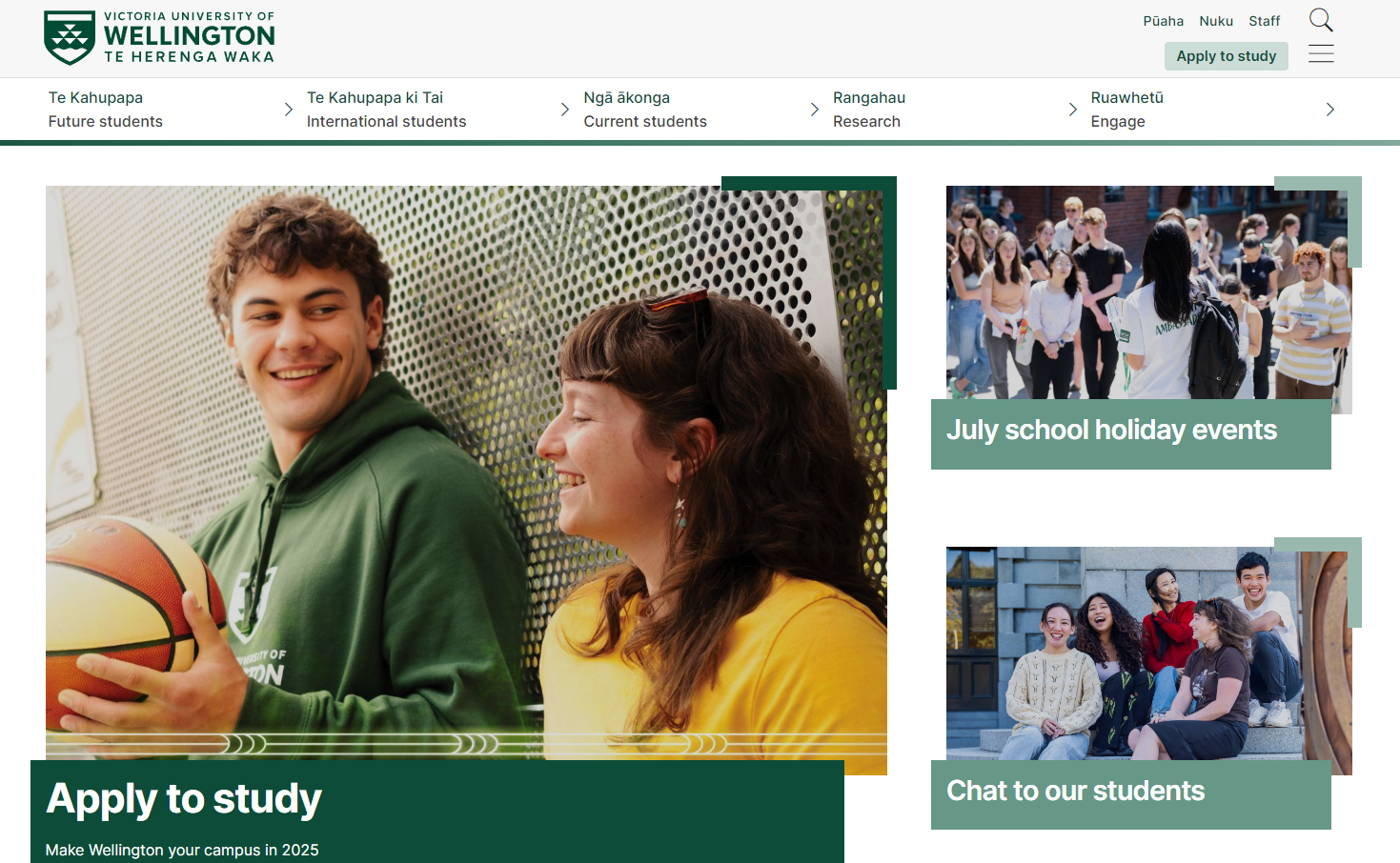
Who says focus state needs to be boring? The university has made the focus state dynamic and interesting on their linked photos by having a small green permanent border extend when the link receives focus. The same effect happens when the user hovers their mouse over the images. It is surprisingly common to see compelling hover states paired with boring focus states - if those focus states aren’t completely forgotten! Web accessibility standards mandate focus states so users can see where they are on a page as they navigate through elements. Using those engaging hover states as focus states can be a great way to inject personality and energy into a website.
Interactive images - MetService

Accessible content doesn’t mean boring content. MetService displays the major cities they report weather for on a map of New Zealand, giving users a visual way to select their city of interest. All of the cities are coded up as links, so they are keyboard accessible and semantically accurate to their function. In mobile view, the map disappears to save space and the cities are displayed in a full-width list.
Accessible transcripts and captions - Education Review Office

Videos are great ways to include engaging content on a website. Transcripts and captions are critical to making sure the content in those videos are accessible to everyone. Captions are a text description of a video’s audio track that runs synchronized as the video is playing. This is meant for people who are deaf or have a hearing loss, but benefit many other users who listen to videos with no sound or who are not primary speakers of that language. Transcripts are also a text version of the video’s audio track, but which is available in full without the video running. This is useful for deaf-blind people, who use assistive technology to read the transcript to understand the video content. Transcripts are also great for SEO, allowing your video content to appear in search results.
Captions usually appear inside the video player frame, but what about the transcript? The Education Review Office places their video transcripts inside an accordion underneath the video. The accordion is keyboard accessible and when opened, reveals the full transcript. This subtle design feature promotes web accessibility - and all the other benefits of transcripts - while maintaining the sleek feel of the design.
Minimalism done right - Wellington City Council

For those who prefer simplicity, Wellington City Council is the design for you. With only three colours, line-drawn icons and just a few photos, the city’s website successfully achieves a minimalist yet exciting look. Plus, it’s accessible: everything on the page is keyboard accessible, all colours meet contrast requirements, interactive elements have a focus state, links are underlined to differentiate them from regular text, and images either have alt text or are decorative and included as background images.
Putting a pause on carousels - Bunnings

Carousels might be one of the most contentious design elements on the web! Some people insist on their use, others loathe them. Either way, there are implementations that are more accessible than others for carousels. For one, if the carousel rotates automatically, the user must be able to pause the movement. That stopping mechanism must be keyboard accessible, like a pause button as opposed to a mouse hover. The carousel on Bunnings’ website also includes dots where the user can select one at a time to view the slide in that position. Not only are those dots keyboard accessible, they also have ARIA labels on them that tell the user which slide they are on out of the total number. For example, if a screen reader user were to land on the first dot, it would read out “Currently on slide 1 of 3”. It would also tell the user that the dot is in fact a button, and that it is contained within a list of 4 items.
Accessible animations - Alphero

Animations can be tricky in accessibility, since movement and sudden changes on a page can be distracting and even dizzying for users. This digital agency leaned into the challenge and created a homepage that is full of accessible movement. The play/pause button for the scrolling animation is not only clearly visible and keyboard accessible, it is actually incorporated into the branding, with the cheeky text “Make it go” and a stylized play button. The cursor also changes shape as the user hovers over the text but the movement is limited to about one second, well within the requirements for WCAG.
Designing with accessibility in mind - Aleph Accessibility

Not to toot our own horn, but we think our website is quite pretty - and it’s accessible. We had a strong vision for our brand: we wanted to be approachable yet professional, incorporating colour and graphics to convey our dynamic style to customer service and accessibility. Fortunately, we knew that an appealing design and web accessibility could work effortlessly together, so we were not concerned about creating a visual identity that would meet all our requirements - including accessibility requirements.
The best part was, since accessibility was considered early in the process, design decisions were easy to make: we were never married to a design before it was assessed for accessibility, and it was natural to pivot from an inaccessible design because we were still in the ideation stage of change and flexibility. This is the concept of “Shifting Left” which allows web accessibility to be easier, cheaper and more seamless to integrate.
With so many beautiful, bold and stylish web designs to choose from, hopefully you will have found some inspiration for your next design. Web accessibility is not a ball-and-chain to hamper creativity; it’s a perimeter to help you create incredible, user-centric designs.
Find out more about Aleph Accessibility's auditing, training and consulting services. Or get in touch to start or accelerate your accessibility journey.